Can't make my avatar pic my profile pic.Can't find post I have thanked or vice versa which helped in a lot of ways . Miss all the nifty icons,not thrilled with the barely visible new ones .More to come.............:aargh:
Printable View
Can't make my avatar pic my profile pic.Can't find post I have thanked or vice versa which helped in a lot of ways . Miss all the nifty icons,not thrilled with the barely visible new ones .More to come.............:aargh:
I happen to like the new layout with a few small exceptions. I now have to click on forums before I can click on "new posts" or "quick links" to get to my subscribed threads. Maybe I just don't know where they are the rest of the time, but I liked being able to find things like that on every page I had opened. Anyone else share this thought, or can advise where I missed that stuff on the new layout? I am not trying to complain by any means. I know some people put some very hard work in to this and I, for one, do appreciate it. I believe the bevel is set, and the blade is sharp, the edge just needs a good finishing hone, metaphorically speaking.
Edit: I now spent a few nimutes in the new layout, and dont think that it is all that bad to have to click forums first to get to new posts. I just need to get used to not being able to do it right from my bookmarked spot. Maybe I will change my book mark to the forums page...
New posts and quick links is what i miss on the main page
I like the new set-up. Thanks to those men behind the curtain that make everything run smoothly. The one thing I have noticed though in some of the thread posts is that the member's stats (ie join date, location, posts, etc) bleed over into the post. See post above as an example. Not really bothersome in short post, but can be distracting in longer ones.
You need to use PNG image, not GIF, the internet is evolving even if slowly.Quote:
Originally Posted by Nightblade
That may not come back soon if ever. It's a third party plugin and we don't have the resources to do much fixing, plus it seems like a low priority compared to other issues.Quote:
Originally Posted by Nightblade
Those may change, it's fairly easy to do, so may be some other dev/mod has the inclination, I personally don't have the time for it.Quote:
Originally Posted by Nightblade
I hate change, but nothing seems overly complicated. What was wrong with the old forum? I think that the site was 1000x better than the other main SR forum. Thanks for taking the time to improving the site!
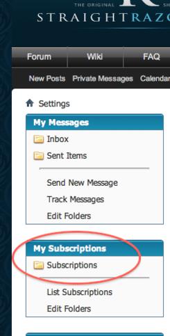
I overall like the new format, it looks clean and polished, almost like SRP went from XP to OSX :). One thing is that I can't seem to find my subscribed threads anymore. I'm trying to find posts on threads that I have posted on. Can anybody help me out?
If you go to 'settings' they're on the left sidebar:Quote:
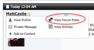
Originally Posted by MattCastle
Attachment 66324
The search index needs to be rebuilt completely since it starts from the oldest posts, and all of yours are from March. Check tomorrow afternoon. Here's a quick way to access them:Quote:
Originally Posted by MattCastle
Attachment 66325
I guess nothing really important to you, but a lot of stuff for me :) We all have personal preferences, some people still prefer the srp yahoo group :)Quote:
Originally Posted by jcsixx
I went away to Las Vegas on Monday and came back to "holy crap batman!". Reminds me of changing to a new operating system as mentioned above...knew where everything else was & what it looked like...now have to think a bit or find something that may have been moved a couple of inches. I'm sure that it's all there, I just have to use a little gray matter again.
Thanks for all the hard work put into keeping things up to date even if I'm a bit outdated myself!
You are hereby PNGerated
.................................................. ............................
Well PNG stands for PNG's Not GIF (recursive geeky acronym). That's just different format for the image. Other popular ones are JPG (or JPEG), TIFF, on in microsoft's world BMP....
So you have to use the correct one. PNG is becoming more and more as the image format for internet content.
Use the converted image from HNSB above, it's in PNG format.
Am I supposed to copy and paste that somewhere? I'm serious.I am not brainy at this not trying to be a Jack*** !
I'll make a walkthrough about how to do it.
It might be useful for other non-techy people as well.
Stand by.
Okay....I'll hold
well when you go to set your profile picture you have to supply image in png format. The attached one from HNSB is that.
Or if you have the picture in a bigger resolution than in your avatar you can convert it yourself and get a better looking png.
I just typed 'convert to png' on google and there were a ton of online converters who can do from whatever your format to png.
I'm sure it's not that complicated as it seems. After all you were able to set up an avatar.
all I did was went to images on google and copied and pasted a pic.I don't know about resolutions or converters.Thanks any way.
I can't explain it any better than this:
This is best viewed full screen & high-def. (click the Youtube link to open it in youtube, then click the icon in the lower right corner to make it 720p, then click the full screen button)
YouTube - Straight Razor Place - Change Avatar and Profile Image
Yeah thanks guys....to user friendly for me ....I think I just wont use an avatar or a profile pic.It's easier that way. Thanks.
.................................................. ..........
There are some bugs that we're working on, and there are some things that have simply changed.
We are working on improving what we can, which involves a lot of time and frustration on the part of several members of the SRP community. Your sarcasm is unwelcome and does nothing to help the situation.
Please feel free to continue giving constructive feedback as you see fit.
First of all, thanks for all the work on the new site. I'm starting to adjust to it and mostly enjoying it.
However, even though this item isn't particularly in line with the OP, I didn't want to start a new thread for it and it seemed to fit with the title.
Not sure if you guys (devs) are aware, or if it's just my machine (Win 7 64bit, using Chrome to browse) but I'm getting a few issues: 1) Some stuff is running in to other stuff. 2) Ads in the top right are displaying rather wonkily. 3) A lot of text is light grey on white background. It makes browsing hte classifieds painful on my eyes, not just my wallet.
http://farm6.static.flickr.com/5225/...ae4e562b_b.jpgscreenshot by harner.bill, on Flickr
I was a bit confused at first, but it really is the same thing! I am sure the reasons for changing are many. I hope it makes things easier for all the fine folks involved! I surely got a kick out of all the "What? Where's my "thanks"?????? They have reappeared! Thats what.
Change, It's always coming! Thanks for all the fine volunteer work here! You guys rock! :rock:
I'd had the same problem as bharner, but it's fixed now. Thanks, Devs!
it's all (except the thanks which i don't see any problem with, and they shouldn't have been affected) the result of the same thing - me trying to set up the ads in a cleaner way. shouldn't be a problem anymore, though i'm not completely finished.
Well, after a few days of struggling with the new format of the main page, I will say that I am ar from being a fan f it. I appreciate there may have been issues with the last format, but there were none that were a problem for me. I now find it harder to navigate the site and feel it has suffered a serious blow to its user friendliness. Obviously I can still use it, but it takes more time to find what is relevant to me and I'm less inclined to bother too much in the looking. I will, of course continue to try to adjust to the new look/system, and who knows, I might even get used to it or learn to like it. My comments are based on giving it a fair go over a few days, instead of just laying down a judgement, and still find it coming up short.
Thanks for the hard work, time and effort those responsible put into the changes, but your efforts were wasted on me.
Many Thanks,
Mick
Mick,
What are specific items you dislike?
Yes, we want to hear what makes you unhappy, but to consider changing anything we need something more specific.Quote:
Originally Posted by MickR
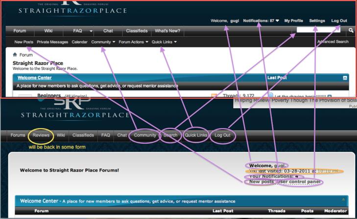
The layout and organization of the forums is exactly the same. The placements of some links have changed, but as far as I can tell it is an improvement from usability point of view. I took two screenshots of the old (minus some stupid 'extras' like the casino) and the new (in the red frame) and there are arrows pointing where things moved. The only thing that's gone is in orange circle - last visit which seemsinessential.
Attachment 66548
Looking at this the 'My Profile' link is redundant as it's already linked to the username in the "Welcome, 'username'", so we'll get rid of it. Same goes with the doubling of the 'new posts' on the navigation menu and submenu.
Cool illustration, Ivan. PM's are also right next to New Posts.
First up, I don't expect anyone to change anything. I expect that there were very good reasons to change the look, and I can respect that. The changing of link placement and merging of some links or re-naming them is what is causing me the most grief. I also preferred to scan the left hand recent posts bar and read some of the original post to see if it was of interest to me. It looks, now to just give a brief of the last post under that heading...I could be wrong there though, I haven't gone so far as to try hovering over the title to see if it brings up an excerpt of the O.P. I hope it does. I will be up front and say I don't like change, especially as I'd only just got my head around the other style. As I said n my first post, I will get used to it and I may even grow to like it. Just for now, I'm living in a little bit of confusion as to where to find things.Quote:
Originally Posted by gugi
Mick
Why not? If something doesn't work that's a pretty good reason to change it. In my opinion the new layout makes a lot more sense. We didn't come up with it though, that's the new vbulletin default with just the srp colors to make it look more familiar.Quote:
Originally Posted by MickR
More clutter makes things just harder, so the best is to duplicate stuff only when it makes sense (e.g. new thread button and navigation by pages at the top and the bottom of the page).
There is no reason to have two identical 'new posts' buttons right next to each other, and neither is there a reason to have two links to the user profile next to each other as well.
I am not a user of the 'new posts', but I assumed if the behavior of that has changed dramatically there'll be a lot of wailing and gnashing of teeth already. i still remember the outcry over the removal (actually relocation in a drop down menu, which required an extra click) of this button a year or so ago - it had to be put back within few hours.
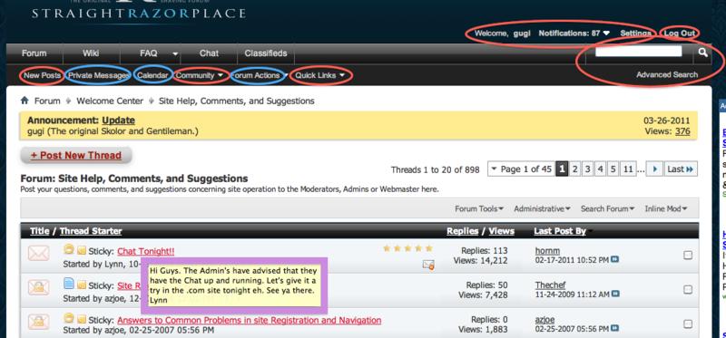
Anyways, here's an updated screenshot of the current look. The red circles denote relocated links, the blue circles denote new links. (I also pointed in the purple frame that hover works).
Attachment 66551
It's pretty easy to remove the stuff in blue and also put the red back in the old places, but as I said they make a lot more sense the way they are now. For example I don't see how a button that says 'Search' is preferable to a simple text field with a magnifying glass next to it where you can just type what you're searching for. Or why 'Community' and 'Quick Links' should clutter the main navigation when they are not equal in importance or usage to the other items there. We did move the block with the settings a little up from where it used to be because on some browsers (at least 7% of the srp traffic) it was obscuring the navigation. It's an old problem and it's been a little annoying to me on other forums that suffer from it, so it's changed.
Sorry gugi, The hover I was talking about referred to the main page, left hand column where you see the snippits of recent posts. I just tried the hover trick over the thread titles in that, and it didn't bring up any of the original post. It is hard to uderstand what a post is about if all you have to read is the last persons reply to the post. Sorry if I am having a hard time explaining what I mean. I use the front page recent posts to go to things of immediate interest before moving on to the seperate pages and sub-folders.
Mick
ah, it's on the srp main page, not the forum. yeah that widget is different than the previous one we used. i'm sure it's doable, there are the thread titles and links there already. it'll probably take me less than an hour, and quite likely less than half an hour, to learn enough vbulletin to make it do what you want, but it's a pretty low priority for now. I'll make a note of it, may be somebody else wants to do it.
Not sure if this is working as designed.. When I first open up SRP the main page with the current threads showing about the contest in the middle and the videos of Lynn on the right. When I click on the thread heading or the read more link it opens the thread in the middle of that page. I assumed ( yes I know what that means ) that if you clicked on the thread heading or the read more link it would take you directly to the forum itself not a huge issue more of an FYI.
I'm assuming you mean the stuff in the middle section? Those are articles and are supposed to be displayed on that page. Clicking forum posts in the container on the right will bring you here.Quote:
Originally Posted by Troggie
Where the confusion may come from is that we have the ability to promote a forum post to a front page article. When that happens it works like an article but has the same information as the original forum post that it was created from.
(note that there are links at the bottom of the article telling you who wrote it and what forum post it came from. Clicking those will take you to the author's profile or to the original post)
If it behaves different from that, please let me know.
Thanks HNSB that explains what I was seeing.