.................................................. ..........
Printable View
.................................................. ..........
There are some bugs that we're working on, and there are some things that have simply changed.
We are working on improving what we can, which involves a lot of time and frustration on the part of several members of the SRP community. Your sarcasm is unwelcome and does nothing to help the situation.
Please feel free to continue giving constructive feedback as you see fit.
First of all, thanks for all the work on the new site. I'm starting to adjust to it and mostly enjoying it.
However, even though this item isn't particularly in line with the OP, I didn't want to start a new thread for it and it seemed to fit with the title.
Not sure if you guys (devs) are aware, or if it's just my machine (Win 7 64bit, using Chrome to browse) but I'm getting a few issues: 1) Some stuff is running in to other stuff. 2) Ads in the top right are displaying rather wonkily. 3) A lot of text is light grey on white background. It makes browsing hte classifieds painful on my eyes, not just my wallet.
http://farm6.static.flickr.com/5225/...ae4e562b_b.jpgscreenshot by harner.bill, on Flickr
I was a bit confused at first, but it really is the same thing! I am sure the reasons for changing are many. I hope it makes things easier for all the fine folks involved! I surely got a kick out of all the "What? Where's my "thanks"?????? They have reappeared! Thats what.
Change, It's always coming! Thanks for all the fine volunteer work here! You guys rock! :rock:
I'd had the same problem as bharner, but it's fixed now. Thanks, Devs!
it's all (except the thanks which i don't see any problem with, and they shouldn't have been affected) the result of the same thing - me trying to set up the ads in a cleaner way. shouldn't be a problem anymore, though i'm not completely finished.
Well, after a few days of struggling with the new format of the main page, I will say that I am ar from being a fan f it. I appreciate there may have been issues with the last format, but there were none that were a problem for me. I now find it harder to navigate the site and feel it has suffered a serious blow to its user friendliness. Obviously I can still use it, but it takes more time to find what is relevant to me and I'm less inclined to bother too much in the looking. I will, of course continue to try to adjust to the new look/system, and who knows, I might even get used to it or learn to like it. My comments are based on giving it a fair go over a few days, instead of just laying down a judgement, and still find it coming up short.
Thanks for the hard work, time and effort those responsible put into the changes, but your efforts were wasted on me.
Many Thanks,
Mick
Mick,
What are specific items you dislike?
Yes, we want to hear what makes you unhappy, but to consider changing anything we need something more specific.Quote:
Originally Posted by MickR
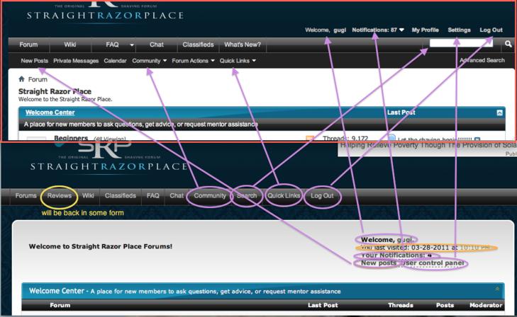
The layout and organization of the forums is exactly the same. The placements of some links have changed, but as far as I can tell it is an improvement from usability point of view. I took two screenshots of the old (minus some stupid 'extras' like the casino) and the new (in the red frame) and there are arrows pointing where things moved. The only thing that's gone is in orange circle - last visit which seemsinessential.
Attachment 66548
Looking at this the 'My Profile' link is redundant as it's already linked to the username in the "Welcome, 'username'", so we'll get rid of it. Same goes with the doubling of the 'new posts' on the navigation menu and submenu.
Cool illustration, Ivan. PM's are also right next to New Posts.