Results 11 to 20 of 20
 21Likes
Thread: Can you help critique this?
 LinkBack URL
 About LinkBacks
-
05-22-2016, 01:08 AM #11Str8Faced Gent.


- Join Date
- Aug 2013
- Location
- Orangeville, Ontario
- Posts
- 8,398
- Blog Entries
- 1
Thanked: 4202
Looks good eh.
Small suggestion regarding the email link though.
Maybe change it to info@ instead of ceo@translation10n. To me, would imply a larger outfit than an email to the CEO themselves.overall, good layout..
Just my $0.02 however. Good luck with the venture..
Cheers."Depression is just anger,, without the enthusiasm."
Steven Wright
https://mobro.co/michaelbolton65?mc=5
-
05-22-2016, 01:16 AM #12
How honest and direct an answer do you want
 Originally Posted by Suticat


-
05-22-2016, 01:18 AM #13Senior Member


- Join Date
- Feb 2008
- Posts
- 32,564
Thanked: 11042
Keep it to PM .............. Originally Posted by gugi
 Be careful how you treat people on your way up, you may meet them again on your way back down.
-
05-22-2016, 01:25 AM #14A Fully-Fleshed Brethren

- Join Date
- May 2013
- Location
- Toronto, Canada
- Posts
- 629
Thanked: 130
Looks nice and does have a professional feel. Just a couple of minor suggestions. On the "home" landing page I would not repeat my tag line in the large central message area. I'd leave the tag line below the company name and come up with another message for the central area. Also further down in the text I'd remove the "focus" wording at the beginning of the last sentence. It's a little repetitive as "focused" is in the previous sentence as well. Last suggestion on the "Our Vision" landing page I'd remove the link to the "Our Vision" landing page or use it for something else.
Suticat likes this.Keep your concentration high and your angles low!
Despite the high cost of living, it's still very popular.
-
05-22-2016, 03:41 AM #15Senior Member

- Join Date
- Mar 2014
- Posts
- 333
Thanked: 65
Thanks. She plans on adding a few more pages that are client/industry specific. The Tag line on the front page will change every few months to keep it fresh. She plans on using it as a marketing ploy. Not 100% sure what she has his mind but she knows. I took the Vision page out of the regular menu bar and made it a sub link on the page. If you look on some mobile devices, the programs are driven by the menu bars. She didn't want it to be part of that and the only way around it was to make a separate link on the page. She is going to add more/better content to in near future so the industry knows who they are dealing with. Name recognition is huge in her business, not so much business name but personal names. There is a lot of turn over/employee hopping within this industry at the level of real decision makers. And they are loyal to each other not the companies. Originally Posted by Brenngun
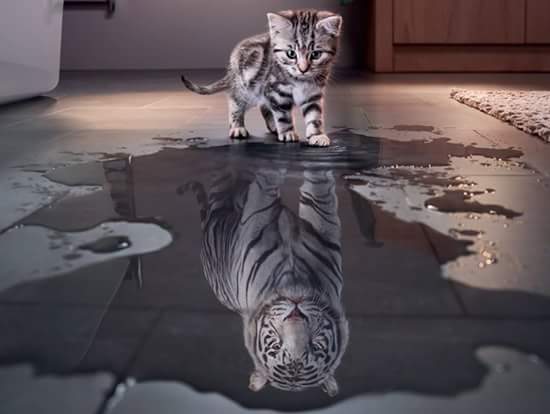
I do know she plans on making a "mascot" for lack of a better term and have it travel with her to meetings, conventions and vacations. It will be posted on the social media as an ongoing story line. She plans on using it as a marking toy too. Some swag for her conventions. These guys are suckers for that kind of stuff. Still trying to come up with a name for it. She's thinking either a lion or a plush toy made to look our leopard cat that was the driving force for the logo. He original idea spawned from the image below. Its all about being one thing and seeing yourself as something bigger and better on the inside. Blah, blah blah... Im just the web guy. LOL
 MikeB52 likes this."The production of to many usefull things results in too many useless people."
Karl Marx
-
05-22-2016, 04:20 AM #16Senior Member


- Join Date
- Jul 2013
- Location
- Kitsap County, WA USA
- Posts
- 1,549
Thanked: 351
Nicely done page. Sends a nice professional message. The only thing I *might* consider is starting some kind of email/newsletter opt-in. You could offer updates or changes in her field, or a freebie guide. Once she grows her email list she has a list of people who have already shown interest in what her and her company does. Great way to launch a new product or get feedback. Looks good, great job
Suticat likes this.The older I get the more I realize how little I actually know.
-
05-22-2016, 04:44 AM #17Senior Member
- Join Date
- Mar 2014
- Posts
- 333
Thanked: 65
She's already been published in several journals and does a does a biweekly publication on her LinkedIn about all sorts of issues within her industry. Next month she is scheduled to speak at a convention in Austin Tx. We are trying to figure out how to incorporate that into the site other than the social media announcements. She has about 1600 followers within her industries vertical on LinkedIn. Originally Posted by MattCB
MattCB likes this."The production of to many usefull things results in too many useless people."
Karl Marx
-
05-22-2016, 08:32 AM #18Senior Member

- Join Date
- Jun 2006
- Location
- The Netherlands
- Posts
- 5,474
Thanked: 656
Looks very professional.
I personally don't like phrases like this one: The core of what we do is driven by the quality we deliver and not by the amount of profit we make
As a customer I am interested in the quality and its price, not the paycheck of the guys doing the work.
I hope she and her colleagues are able to deliver all their promises.
I once translated a Dutch borchure into English for the father of a friend of mine. That was a tough job with all the jargon that does not always translate well into another language.Plus ça change, plus c'est la même chose. Jean-Baptiste Alphonse Karr.
-
05-22-2016, 10:55 AM #19
When? . Originally Posted by Utopian
Bread and water can so easily become tea and toast
-
05-22-2016, 01:44 PM #20illegitimum non carborundum

- Join Date
- Jan 2008
- Location
- Rochester, MN
- Posts
- 11,544
- Blog Entries
- 1
Thanked: 3795
I chose not to respond to post 47 HERE. Originally Posted by edhewitt


 Reply With Quote