Results 1 to 10 of 30
Thread: Keep it or sand it off
-
11-26-2008, 02:44 AM #1Senior Member


- Join Date
- Feb 2007
- Posts
- 392
Thanked: 105 Keep it or sand it off
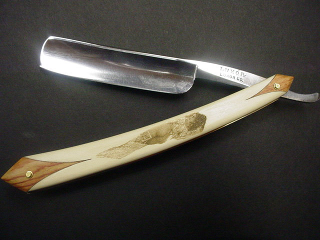
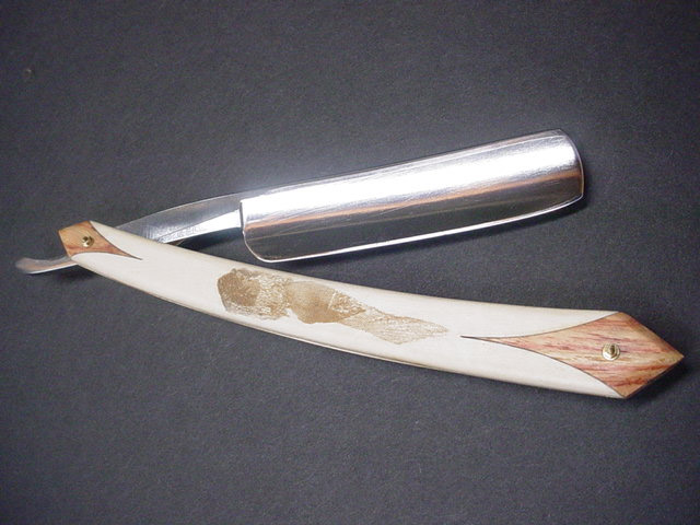
Your opinion is needed. Keep the lady or sand her off. Holy with tulipwood ends brass liner and wenge spacer. I have not finished it because I don't know if I like the engarving I did. 6/8 Luxor blade that was the victim of scale rot.


Thanks for you honest opinions
Tim
-
11-26-2008, 02:46 AM #2

I'd leave her be. She looks mighty nice. Real fine job !
Be careful how you treat people on your way up, you may meet them again on your way back down.
-
11-26-2008, 03:01 AM #3

She is a keeper Tim. Great job!
Be just and fear not.
-
11-26-2008, 03:08 AM #4

Great looking job as is your usual....KEEPER, if not, SEND HER TO ME>>>hehe
Having Fun Shaving
-
11-26-2008, 03:11 AM #5

Hey Tim! Make you another set and send those to me!
 It is easier to fool people than to convince them they have been fooled. Twain
-
11-26-2008, 03:13 AM #6

Depends. If you are looking for class, then sand it off. Her butt, even though very round and succulent is misshapen because of the great disparity in buttcheek dimensions. The lower legs are confusing. Are they winter boots, or some scary fur creating, foot rotting disease? Personally, I like delicate toes without fur. Overall, the scales look great. Besides, laser etching is nothing to be admired, scrimshaw a different story, anyone can tell the difference. My personal opinion is that the scales are perfect, minus that etching. Sand it off.
-
11-26-2008, 03:13 AM #7
-
11-26-2008, 05:42 AM #8

I mostly agree with Ditch here honestly. Before I sand it off though I would have to see it in person. I have a feeling it could look either much better or slightly worse in person. Hard to tell. Anyway, yes, it can be a confusing image in places (which isn't always a bad thing) and I'm still a little confused about a couple things lol. I do like the idea of an image on these scales, but I don't think this is the one.
-
11-26-2008, 11:29 AM #9

From the pics it looks fine. Great job.

If, seeing it live shows too much grain I would sand it off. Why dio both sides have the same image and not a front/back image?If you always do what you always did, you will always get what you always got. (A. Einstein)
-
11-26-2008, 03:31 PM #10

sand it! It looks nice, but somehow I like the style better than the form...
Find me on SRP's official chat in ##srp on Freenode. Link is at top of SRP's homepage


 LinkBack URL
 About LinkBacks


 Reply With Quote


