
Results 11 to 19 of 19
Thread: Evolution of a meany
 LinkBack URL
 About LinkBacks
-
02-09-2009, 11:51 PM #11The Great & Powerful Oz


- Join Date
- May 2008
- Location
- Bodalla, NSW
- Posts
- 15,635
Thanked: 3751
I really like the fluidity in the design. My only concern would be if the large cut out added any fragility.
The white gleam of swords, not the black ink of books, clears doubts and uncertainties and bleak outlooks.
-
02-10-2009, 01:10 AM #12Senior Member
- Join Date
- Dec 2008
- Posts
- 130
Thanked: 9
Thanks for your input! When i made these not once did i think about balance, good point its something i will have to keep in mind on the next set. Originally Posted by floppyshoes

that pic was the second coat, i had just applied the second coat when i took that pic so it was still wet. it was probably still to thick though
-
02-10-2009, 01:10 AM #13The Razor Whisperer

- Join Date
- Jan 2008
- Location
- Rhode Island
- Posts
- 2,197
Thanked: 474
I liked... I mean like the 'skeletonized' scales idea... obviously.
Nice design of an abstract set of scales. It looks like you are executing your idea well. You need to clean a lot of things up though.
It looks like your lines aren't as smooth as they could be. That means either more machine or hand sanding until things feel smooth when you run your finger along them. I agree that this cutout on a set of wood scales like that may put the balance off. On the above razor the balance works, but I'm guessing the wood you used is lighter by nature. The edges could use more even contouring to look fluid. Now call it personal opinion or whatever, but the pivot end looks way too 'bulbous' in proportion to the rest of the scales. It just takes away from the artistic nature IMO because proportion and line direction still play an important role– especially with a razor pinned to them. I agree that the finish could use a little work too. I'd do what Glen often does and at the point you're at, sand it down to the grain so that the grain is filled and your next coats will be smooth.
You asked for my honest critique Mike, so use it how you will!
P.S.– I think your asking for honest critiques and wanting to hear the negative is a refreshing and brave thing to do. Bravo.Last edited by Philadelph; 02-10-2009 at 01:21 AM.
-
The Following User Says Thank You to Philadelph For This Useful Post:
Jimbo (02-10-2009)
-
02-10-2009, 01:24 AM #14There is no charge for Awesomeness


- Join Date
- Aug 2006
- Location
- Maleny, Australia
- Posts
- 7,977
- Blog Entries
- 3
Thanked: 1587
Ditto. Well-said Alex. Originally Posted by Philadelph
We never grow unless we challenge ourselves. Good on you Mike!
James.<This signature intentionally left blank>
-
02-10-2009, 02:54 AM #15Senior Member
- Join Date
- Dec 2008
- Posts
- 130
Thanked: 9
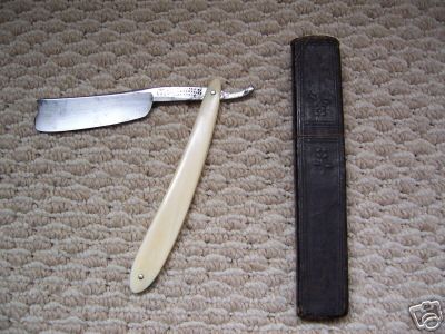
UPDATE
Well here it is finished, the wedge gave me serious issues.. serious serious issues.. i should have picked something other than mammoth ivory for my first time. I couldnt find my washers either so i just pinned it without them.
The second picture is the finished finished product, i failed at scale making but i bet none of you put as much time into a stick man as me. true art. *grin*
-
02-10-2009, 03:01 AM #16Member

- Join Date
- Jan 2009
- Location
- Ottawa or Toronto Canada
- Posts
- 82
Thanked: 16
Honestly it doesn't look bad at all, it's actually pretty sweet. Tho That stick man is one sexy beast.
-
02-10-2009, 03:15 AM #17
This is so restrictive that I can't comment - impossible for me to pick just one Originally Posted by M1ke

-
02-10-2009, 03:19 AM #18Usagi Yojimbo


- Join Date
- Jan 2007
- Location
- Ramona California
- Posts
- 6,858
Thanked: 792
Originally Posted by gugi
 Nice gugi!
-
02-10-2009, 03:39 AM #19The Shell Whisperer

- Join Date
- May 2008
- Location
- Sin City
- Posts
- 5,597
Thanked: 3384
You need to start somewhere and there's always going to be a first time. Alex pretty much nailed it. Just try to learn from advise given and it will evolve into a masterpiece. Kudos for learning, asking and trying!
əˌfisyəˈnädō | pərˈfekSH(ə)nəst | eS'prəSSo | düvəl ləvər


 Reply With Quote
 please post one thing you dont like about these scales. i will not take it personal. it will only help me learn!