Results 11 to 20 of 26
-
10-29-2013, 12:29 AM #11Senior Member


- Join Date
- Apr 2008
- Location
- Essex, UK
- Posts
- 3,816
Thanked: 3164
I dont think they stamped blades. Tangs yes - before hardening. If you stamp after hardening the metal, now very brittle, shatters.
Besides, during hardening the steel moves around and deforms a bit in the thin parts - the blade - so it is left a lot thicker to counteract this, then ground to its finished stage before tempering to relieve the stresses. Obviously this would erase any marking.
Anyting on the blade would be acid etched (depth aka bite and colour fully controllable from light fosting to deep relief) or engraved, with the telltale engraving marks showing whether it was hand or machine engraved.
So no chance of upside down characters or mixing font types, just the vagaries of the process involved and the inevitable signs that a human did it on a concave surface, IMO.
Regards,
Neil
PS Voidmonster - still up for hand encoding ocr?!
Last edited by Neil Miller; 10-29-2013 at 12:31 AM.
-
10-29-2013, 12:33 AM #12
 -Zak Jarvis. Writer. Artist. Bon vivant.
-
10-29-2013, 12:36 AM #13Senior Member


- Join Date
- Apr 2008
- Location
- Essex, UK
- Posts
- 3,816
Thanked: 3164
-
10-29-2013, 01:08 AM #14
-
10-29-2013, 03:37 PM #15

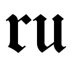
That which appears to be a lower case "b" is, in fact, a variation of the serif on a lower case "u". "Concave" would be correct. I once produced a work "Glove" catalog embossed with the same font: I got a lot of calls about our "Globe" catalog. I altered the font to a more modern version in the second printing.

From Congrabulations on Your Grabuation! - Tweed - The Chronicle of Higher Education
"“That’s a traditional Old English font, which many students are not familiar with, with a long serif on the left-hand side that makes a ‘v’ look like a ‘b.’”
Concur. Looks hand etched. I wonder if the "R" in "GENRINE" was just a mistake. Literacy in the trades was not at its apex in the UK in the mid 19th century.The straights are a little too wobbely, and the serifs look wrong.Last edited by MisterMoo; 10-29-2013 at 03:45 PM.
"We'll talk, if you like. I'll tell you right out, I am a man who likes talking to a man who likes to talk."
-
10-29-2013, 05:27 PM #16Senior Member


- Join Date
- Apr 2008
- Location
- Essex, UK
- Posts
- 3,816
Thanked: 3164
It is not an 'r' - if you look at Iceni's font, the end of the first upright in a lowercase 'n' is lozenge shaped and does not touch the other upright, which curves away from it at the bottom. The first upright of a lowercase 'u' is serifed with a small rise towards the next upright, which is also serifed at the top and so it touches the first upright at both top and bottom. What is missing is the central portion of the last upright - either the etchers stylus did not go sufficiently deeply through the wax, or the resist stamp had become a little worn.
comparing the 'nuin' portion of 'genuine' shows as much.

The lowercase 'r' in this font would look altogether different. It would have just one small serif at the bottom, much smaller than that shown on the blade.

Regards,
NeilLast edited by Neil Miller; 10-29-2013 at 05:46 PM.
-
10-29-2013, 11:08 PM #17
-
10-29-2013, 11:12 PM #18

In the late 1800's, Elliot went on a buying spree of old marks. They nabbed Shepherd's 'WOLF' logo, John Barber's marks (as well as I. Barber!) and a whole bunch of others. I've never seen any Elliot-produced WOLF or JOHN BARBER razors, but they owned the marks to do it if they wanted to.
-Zak Jarvis. Writer. Artist. Bon vivant.
-
The Following User Says Thank You to Voidmonster For This Useful Post:
Miner123 (10-29-2013)
-
10-30-2013, 12:25 AM #19

I wonder if it is not based on one of many dialects found in the Isles. Sounds of some Welsh, Celtic variation or such. Could that be it? Not neccessarily a spelling, but a pronunciation???
"Don't be stubborn. You are missing out."
I rest my case.
-
10-30-2013, 01:12 AM #20Senior Member


- Join Date
- Apr 2008
- Location
- Essex, UK
- Posts
- 3,816
Thanked: 3164


 18Likes
 LinkBack URL
 About LinkBacks


 Reply With Quote


