Results 1 to 4 of 4
Thread: Dorko Logo Differences
-
05-29-2011, 01:32 PM #1
 Dorko Logo Differences
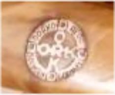
I've been wanting a nice Dorko, but either missed out or just didn't see what I wanted. I did notice that there's at least three different logos used. One is the familiar "Dorko circled cross." The second is an elongated diamond shape with the lettering for Dorko increasing and decreasing in size to fill the space. The third is a large "D" with the rest of the lettering smaller and "Solingen" underneath.
So, I'm wondering if they changed their logo for a different look, if it signifies a different grade of their line, or if it can be used to roughly date Dorko razors. What are your thoughts?I strop my razor with my eyes closed.
-
05-29-2011, 09:34 PM #2

To tell you the truth I have 3 Dorko's and they are all different. The actual insignia on the razor is one thing and the Dorko insignia on the scales is another. On mine the scale insignia is all a little different in color and how the words are placed around the seal. The others you mention I'm not familiar with.
No matter how many men you kill you can't kill your successor-Emperor Nero
-
05-30-2011, 12:10 AM #3

This may help.


 I strop my razor with my eyes closed.
-
05-30-2011, 10:42 PM #4

The ones I have a like the first you show but even there, there is variation in the way they words are arranged and colors and the font. The other two I haven't seen.
No matter how many men you kill you can't kill your successor-Emperor Nero


 LinkBack URL
 About LinkBacks


 Reply With Quote
