Results 1 to 6 of 6
 25Likes
Thread: Logo
-
10-21-2018, 11:35 AM #1
 Logo
Logo
Hello guys and gals,
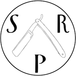
With the upcoming Movember fundraiser a number of people thought that it would be nice and helpful to have some sort of a logo we can use.
After consideration with the moderators and mentors we settled on this one:

We will probably develop another one down the road but in the meantime it is good to have something that identifies us. It's already featured on every page of the site at the top left corner, although you may have to force reload the page
I hope you like it as much as we do, but more importantly I hope that we will have another very successful Movember and be able to contribute to this global fundraiser and awareness initiative for men's health issues just as we have done for the past seven years.
I have always been very proud of who we are and our values. Helping another great cause exemplifies the openness, selflessness and generosity of our community!
-
-
10-21-2018, 11:39 AM #2Senior Member


- Join Date
- Feb 2018
- Location
- Manotick, Ontario, Canada
- Posts
- 2,794
Thanked: 557
FYI - I had to clear my browser’s history and cache before the logo appeared.
David
Shared sorrow is lessened, shared joy is increased
― Spider Robinson, Callahan's Crosstime Saloon
-
The Following User Says Thank You to DZEC For This Useful Post:
gugi (10-21-2018)
-
10-21-2018, 01:23 PM #3

I really like it... nice touch for movember!!!
honing my mind...
-
10-21-2018, 04:45 PM #4

Looks good to me. Maybe it would be good to spell out "Straight Razor Palace" to the right of it? There's a lot of empty space there.
Striving to be brief, I become obscure. --Horace
-
10-21-2018, 05:19 PM #5

On my monitor, the razor gets lost, washed out, due to lack of contrast withe the blue header. Could reverse the settings for letters and razor??
JMO
~RichardBe yourself; everyone else is already taken.
- Oscar Wilde
-
10-21-2018, 06:40 PM #6

The razor and the letters are the same color, it's just that the razor lines are much thinner and when scaled down they got very thin. I'll try to improve it but I am fairly amateurish with image editing.
Also the razor is originally a paper drawing, so it's not trivial to just increase the line width. The hand drawn quality to me gives it a different feel than if it were done all in software and it's important to me. I'm looking forward to getting it on a t-shirt or something in larger size as I think it'll look pretty nice
It'll definitely get better over time as we tweak those things
-


 LinkBack URL
 About LinkBacks


 Reply With Quote

