Results 31 to 37 of 37
Thread: New layout gripes
 LinkBack URL
 About LinkBacks
-
03-31-2011, 06:09 AM #31May your bone always be well buried


- Join Date
- Jun 2010
- Location
- Brisbane/Redcliffe, Australia
- Posts
- 6,380
Thanked: 983 First up, I don't expect anyone to change anything. I expect that there were very good reasons to change the look, and I can respect that. The changing of link placement and merging of some links or re-naming them is what is causing me the most grief. I also preferred to scan the left hand recent posts bar and read some of the original post to see if it was of interest to me. It looks, now to just give a brief of the last post under that heading...I could be wrong there though, I haven't gone so far as to try hovering over the title to see if it brings up an excerpt of the O.P. I hope it does. I will be up front and say I don't like change, especially as I'd only just got my head around the other style. As I said n my first post, I will get used to it and I may even grow to like it. Just for now, I'm living in a little bit of confusion as to where to find things.
 Originally Posted by gugi

Mick
-
03-31-2011, 06:52 AM #32
Why not? If something doesn't work that's a pretty good reason to change it. In my opinion the new layout makes a lot more sense. We didn't come up with it though, that's the new vbulletin default with just the srp colors to make it look more familiar. Originally Posted by MickR
More clutter makes things just harder, so the best is to duplicate stuff only when it makes sense (e.g. new thread button and navigation by pages at the top and the bottom of the page).
There is no reason to have two identical 'new posts' buttons right next to each other, and neither is there a reason to have two links to the user profile next to each other as well.
I am not a user of the 'new posts', but I assumed if the behavior of that has changed dramatically there'll be a lot of wailing and gnashing of teeth already. i still remember the outcry over the removal (actually relocation in a drop down menu, which required an extra click) of this button a year or so ago - it had to be put back within few hours.
Anyways, here's an updated screenshot of the current look. The red circles denote relocated links, the blue circles denote new links. (I also pointed in the purple frame that hover works).
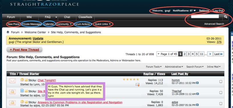
It's pretty easy to remove the stuff in blue and also put the red back in the old places, but as I said they make a lot more sense the way they are now. For example I don't see how a button that says 'Search' is preferable to a simple text field with a magnifying glass next to it where you can just type what you're searching for. Or why 'Community' and 'Quick Links' should clutter the main navigation when they are not equal in importance or usage to the other items there. We did move the block with the settings a little up from where it used to be because on some browsers (at least 7% of the srp traffic) it was obscuring the navigation. It's an old problem and it's been a little annoying to me on other forums that suffer from it, so it's changed.
-
03-31-2011, 07:02 AM #33May your bone always be well buried
- Join Date
- Jun 2010
- Location
- Brisbane/Redcliffe, Australia
- Posts
- 6,380
Thanked: 983
Sorry gugi, The hover I was talking about referred to the main page, left hand column where you see the snippits of recent posts. I just tried the hover trick over the thread titles in that, and it didn't bring up any of the original post. It is hard to uderstand what a post is about if all you have to read is the last persons reply to the post. Sorry if I am having a hard time explaining what I mean. I use the front page recent posts to go to things of immediate interest before moving on to the seperate pages and sub-folders.
Mick
-
03-31-2011, 07:15 AM #34
ah, it's on the srp main page, not the forum. yeah that widget is different than the previous one we used. i'm sure it's doable, there are the thread titles and links there already. it'll probably take me less than an hour, and quite likely less than half an hour, to learn enough vbulletin to make it do what you want, but it's a pretty low priority for now. I'll make a note of it, may be somebody else wants to do it.
-
The Following User Says Thank You to gugi For This Useful Post:
MickR (03-31-2011)
-
04-07-2011, 06:09 PM #35Inane Rambler

- Join Date
- Apr 2010
- Location
- Chandler, AZ
- Posts
- 574
Thanked: 128
Not sure if this is working as designed.. When I first open up SRP the main page with the current threads showing about the contest in the middle and the videos of Lynn on the right. When I click on the thread heading or the read more link it opens the thread in the middle of that page. I assumed ( yes I know what that means ) that if you clicked on the thread heading or the read more link it would take you directly to the forum itself not a huge issue more of an FYI.
-
04-07-2011, 08:09 PM #36This is not my actual head.


- Join Date
- Nov 2009
- Location
- Middle of nowhere, Minnesota
- Posts
- 4,624
- Blog Entries
- 2
Thanked: 1371
I'm assuming you mean the stuff in the middle section? Those are articles and are supposed to be displayed on that page. Clicking forum posts in the container on the right will bring you here. Originally Posted by Troggie
Where the confusion may come from is that we have the ability to promote a forum post to a front page article. When that happens it works like an article but has the same information as the original forum post that it was created from.
(note that there are links at the bottom of the article telling you who wrote it and what forum post it came from. Clicking those will take you to the author's profile or to the original post)
If it behaves different from that, please let me know.
Strange women lying in ponds distributing swords is no basis for a system of government.
-
The Following User Says Thank You to HNSB For This Useful Post:
Troggie (04-08-2011)
-
04-08-2011, 01:48 PM #37Inane Rambler
- Join Date
- Apr 2010
- Location
- Chandler, AZ
- Posts
- 574
Thanked: 128
Thanks HNSB that explains what I was seeing.


 Reply With Quote