
Results 51 to 60 of 91
 132Likes
 LinkBack URL
 About LinkBacks
-
05-26-2016, 01:44 AM #51barba crescit caput nescit


- Join Date
- Jul 2013
- Location
- Toronto, Canada
- Posts
- 9,680
Thanked: 2700 LOL - like wearing a fake Rolex or something, you can just ache with embarrassment for some poor razor enthusiast who showed that to someone, and watch the guys heart break as someone told him, "that ain't the real deal son, the razors never looked like that....bwahahahaha, sorry..."
 Originally Posted by JimmyHAD


-
05-26-2016, 01:46 AM #52Senior Member
- Join Date
- Aug 2013
- Location
- NYC, NY
- Posts
- 1,497
Thanked: 169
Well, that is a question of a buyer being lied to... Or a buyer trying to fib to impress someone
-
05-26-2016, 01:52 AM #53Senior Member

- Join Date
- Oct 2010
- Location
- Everett, Ontario
- Posts
- 1,554
Thanked: 309
I think its ok to re-etch something that was there before and lost due to ware or restore work etc. But not to add. These are my match pair of 7/8 W&B Masonic razors and i need to get this back on them.
Phrank likes this.
-
05-26-2016, 01:59 AM #54Razor Vulture

- Join Date
- Oct 2010
- Location
- Lone Star State
- Posts
- 26,195
Thanked: 8624
Just a way to sell something to the uneducated. Nothing un-observable about it, if you do your homework.
Every time it happens, Many more are educated. Sad part is many nice old ones are ruined as these sort of things are done.
JMHOLast edited by sharptonn; 05-26-2016 at 02:31 AM.
Phrank likes this."Don't be stubborn. You are missing out."
I rest my case.
-
The Following User Says Thank You to sharptonn For This Useful Post:
Phrank (05-26-2016)
-
05-26-2016, 02:04 AM #55Senior Member


- Join Date
- Oct 2010
- Location
- 50 miles west of randydance
- Posts
- 9,699
Thanked: 1355
After you change the grind you might as well change the scales and the pins. Originally Posted by TrilliumLT
The wedge looks funky also.....
Where do you stop?
-
05-26-2016, 02:17 AM #56barba crescit caput nescit
- Join Date
- Jul 2013
- Location
- Toronto, Canada
- Posts
- 9,680
Thanked: 2700
TriilumLT - this is about the OP post....I think there is a difference between enhancing an existing stamp or etch, and pasting one on....:-)
To laser graft (or whatever), in some large, completely unsuitable font, that etching again would be ridiculous and for no other reason than to get higher dollars, it just removes whatever value the razor had prior to that in my opinion.
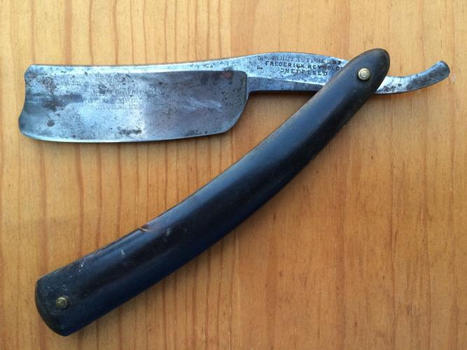
Here's an old Frederick Reynolds 9/8 I have. If you look closely, it has, "The Celebrated Hollow Ground Razor, For Barber's Use", acid etched on the blade face. It's badly faded, you can actually see it somewhat clearly in this photo. I simply can't imagine how grotesque it would look with some large modern typeface splayed on the face, even though it was there, it would just ruin whatever authentic value the razor had IMO for a few extra bucks....aside from that money motive, I simply can't wrap my head around the thought process to do something like that....
Last edited by Phrank; 05-26-2016 at 02:19 AM.
sharptonn and HARRYWALLY like this.
-
05-26-2016, 02:27 AM #57I love Burls....... and Acrylic

- Join Date
- Mar 2012
- Location
- Baden, Ontario
- Posts
- 5,475
Thanked: 2284
That blade is perfect the way it is in my opinion Andrew. If it were mine, I'd steel wool with oil any rust, hone it and use it....... and look at it every day too.
Tom convinced me to keep this etch on my JR diamond edge, didn't take much convincing, but I'm glad he did. Even though most of the top portion has been honed away, It wouldn't look right without that beautiful, old style etch.
 Burls, Girls, and all things that Swirl....
-
The Following User Says Thank You to HARRYWALLY For This Useful Post:
sharptonn (05-26-2016)
-
05-26-2016, 02:30 AM #58barba crescit caput nescit
- Join Date
- Jul 2013
- Location
- Toronto, Canada
- Posts
- 9,680
Thanked: 2700
That's exactly what Val did, cleaned it up, honed it, and it sits exactly as I got it in my razor chest, scales were OK and still on it, great blade, one of my favorites. Originally Posted by HARRYWALLY
Loving the the look of the Diamond Edge, I remember that one, and as usual Tom is correct....man that's a gorgeous razor, just can't imagine defacing something like that.sharptonn and HARRYWALLY like this.
-
The Following User Says Thank You to Phrank For This Useful Post:
HARRYWALLY (05-26-2016)
-
05-26-2016, 02:39 AM #59barba crescit caput nescit
- Join Date
- Jul 2013
- Location
- Toronto, Canada
- Posts
- 9,680
Thanked: 2700
Do you have a pic of that JR D E all put together and posed real nice.....? Originally Posted by HARRYWALLY

Would love to see it....
edited to add: doh...just saw you're working on it in the "working on stuff" thread....
Last edited by Phrank; 05-26-2016 at 02:52 AM.
HARRYWALLY likes this.
-
07-06-2016, 11:01 PM #60Senior Member

- Join Date
- Sep 2011
- Posts
- 1,650
Thanked: 1342
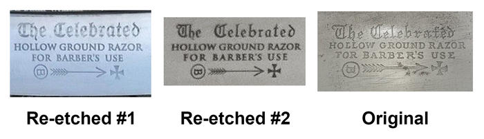
Ok here's an update. I found another one on ebay from the same place, only this time... the etching is more closely reflecting an original example. This is going to be a lengthy post. Let's start with a composite of a bunch of genuine FBU examples collected from my own holdings as well as all over ebay and the internet, so we can get an idea of how much the fonts and positionings varied (hint: not actually that much). I'm going to analyze all of these and figured a good sample size would be nice to make claims.
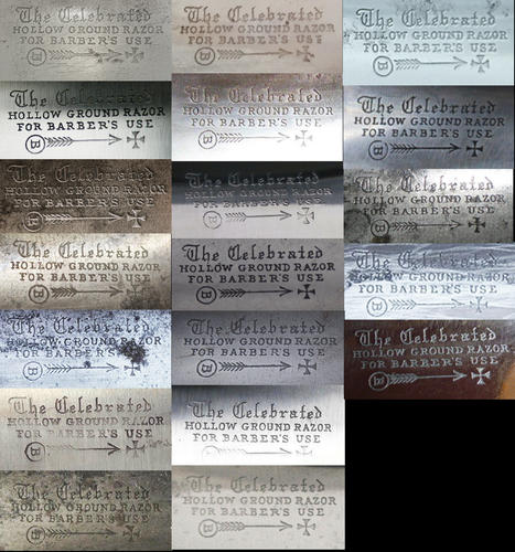
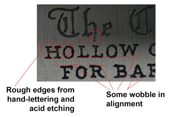
And looking closer, we can see some characteristics of the original acid-etched examples, most notably non-uniform fonts and rough text edges due to the etching process:
Below, left, is the first re-etched example I saw on ebay. You can see it's very, very poorly done. The middle image is the most recent one I found, which is better and obviously after learning some things to make it look more original. To someone who knows fonts well, the 'FOR BARBER'S USE' part especially should look glaring in comparison. A genuine example is at the right.
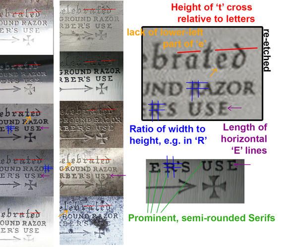
Here is an in-depth comparison. Some things to assist in comparison: 1. The height of the cross of the 't' is different in the most recent re-etch than in all other vintage samples (red). 2. The general shape and ratios of the letters is different (blue). 3. The small blackletter 'e's are missing a part at the lower left that is seen in all old examples (orange). 4. The length of mid-level horizontal lines of 'F' and 'E' relative to top and bottom is incorrect (purple). 5. Original fonts had very rounded, prominent serifs (green). These are sharper and smaller on the re-etched example.
There are other small details but this is a good sampling to get you to recognize how to spot these.
Finally, on this particular example, there is clear evidence of buffing on the tang, with a very fresh looking grind on the blade face. This has been reground, however it clearly has a nice crisp etch. Compare another example with original etch that has been reground and polished:

The latest one I came across was listed as 'restored' and not 're-etched'.
-
The Following 7 Users Say Thank You to ScienceGuy For This Useful Post:
aaron1234 (07-06-2016), dinnermint (07-07-2016), HARRYWALLY (07-06-2016), JimmyHAD (07-07-2016), MW76 (07-07-2016), Phrank (07-06-2016), sharptonn (07-06-2016)


 Reply With Quote