Results 11 to 15 of 15
Thread: Dovo Razor Ad
-
03-23-2007, 09:17 AM #11
So true about grammar nazis! I have battled my own problem and, most of the time, can resist the urge to respond. But sometimes, well... every time I see an old episode of Star Trek (and don't get me wrong, it's not often, I'm NOT a Trekkie!! ), I can't help but jump up from the armchair and start ranting about split infinitives.
"To boldly go..." arggggggh!
X -- possibly, but on the whole I'm a lot more relaxed with electronic media since I read Marshall McLuhan, who has argued that traditional grammatical rules should not apply to modern or 'hot' media (e.g. txting - u no wot i mean?), email (so often junking capitalisation), etc.
-
03-23-2007, 01:01 PM #12
- Join Date
- Sep 2006
- Posts
- 1,180
Thanked: 1The use of the name Jesus
Gentlemen,
I would not normally bring this up here but I must make a request. We all try to respect others on this board and do so quite successfully most of the time. In that spirit, I'm asking that we find another way to express shock, frustration, etc other than by the use of the name of Jesus. (i.e.- J***, Xman....).
I won't go into a debate here about blasphemy and God's moral law as this isn't the place, though I will be happy to have private conversations with anyone. Suffice it to say that to me, and I believe others, this misuse of the name of the Saviour is offensive.
Now, I'm not trying to start arguments or fights or to offend anyone. I hope you will all take this for what it is, just a request.
I thank you all for your consideration.
Steve
-
03-23-2007, 03:24 PM #13
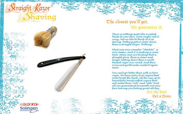
All very good advice, and I do agree. I should have put more time into the content of the ad it self, but I mainly focused on the layout and design as the project was for a graphic design class. I normally don't get too much into the content of an add, rather the graphical appearance. Still, I should have taken more time on the text, instead of writing it up in ten minutes and pasting it in.
As far as the frilly boarder texture and font, I probably should have gone with a different color scheme. While the blue, orange, and yellow work well together, I see your point about those colors not really reaching out in a masculine way. As far as the pattern and font it self, well this was intended to give it a sort of neo, retro, classic look. Straight razors are classic, but have lately been making a comeback. So they are classic but new at the same time. I had hoped to communicate this with a more classic looking patterns and typography, but maybe I fell short. Either way, I was really just wanting to show you guys something razor related. Thanks for the critiques though .
Matt
-
03-23-2007, 08:06 PM #14
-
03-23-2007, 08:10 PM #15
- Join Date
- Sep 2006
- Posts
- 1,180
Thanked: 1