Sorry, Rez! :)
Attachment 261238
Printable View
Sorry, Rez! :)
Attachment 261238
In the "on deck" circle for the burl blast blanks is green actually as a heads up.
A green swirled with the the right burls might look pretty cool I'm thinking so it's on the to cast list..
Just in case folks are interested..similar to the blue and red it shall be I expect...
This is looking AWESOME, Mike! It's true, on the original scales the letters were not perfect so I'm thinking perfect looking letters would look less than authentic? Whatever you come up with will be fantastic I'm sure, and very much appreciated. The work and careful consideration you are giving this project is amazing and I want to say another big THANK YOU! It feels pretty cool to have something of mine in your workshop/laboratory. :tuQuote:
Originally Posted by MikeB52
In the meantime, I'm going to repaint the lettering on the blade to try to get a brighter red. I'll follow (outback) Mike's suggestion and put a coat of white in the tang stamp first then follow up with red.
Make sure the white is good and dry before the red....unless you want pink.Quote:
Originally Posted by xiaotuzi
https://uploads.tapatalk-cdn.com/201...3632802d43.jpg
GAWD, Mike, those things are like neon! Where on EARTH did you............Quote:
Originally Posted by outback
Nevermind! :o
I hear you! Some razors do not like my 16K Shapton Glass hone. I have found doing 4 to 8 very light , no pressure laps on my Coti. make it shave much better & smother after the 16K hone.Quote:
Originally Posted by Martin103
Slawman
A coticule is usually the last stone my blade touches as well. My face, especially my neck, is subject to irritation if the edge is too crisp from a high number synthetic. A handful of passes on the coti after my highest synthetic puts it right in the sweet spot for me.
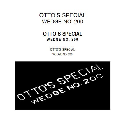
Nearly ready to drop the hammer.
Went with the original scan as per consensus and have scaled the dimensions to those recorded off the originals.
Trialed it out on a scrap of corian as it gives a cleaner edge than wood and filled it for effect.
Attachment 261287
And Tuzi, appreciate the fine compliments, and your patience on the job. I'm thorough, not fast, hehehe
:beer1:
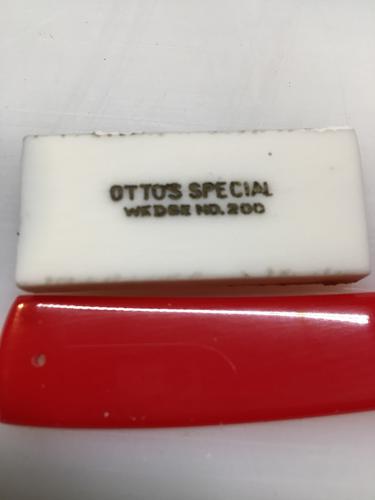
Looks very cool Mike, looks aged, like it's been around for years.
Perfect, Bruv! :tu