Results 11 to 20 of 24
-
01-11-2022, 05:45 AM #11I'm a social vegan. I avoid meet.


- Join Date
- Nov 2006
- Location
- Greenacres, FL
- Posts
- 3,366
Thanked: 603
That's MY "latest posts". I began this thread as an observation about an issue with the unavoidable two-step procedure to access "New Posts". It would not be necessary if "New Posts" was available on the Home page menu bar. There are other two-step variations: Click "Forum", "Buy/Sell/Trade", "Paid Subscriptions", or "Settings" -- any of these brings you to the menu bar with "New Posts" available. I simply noticed that clicking my username on the Home page defaulted to "My Activity:All", rather than "My Activity:JBHoren". Still seems silly to me, but that's the way it is.
Regardless, the results displayed by clicking "Find latest posts" is exactly the same as clicking "My Activity:JBHoren" (except "Find latest posts" moves the display from "My Activity" to a search-generated listing. Given the choice, I'll always opt for the "My Activity:JBHoren" display, which enables me to quickly move between the different views (All, JBHoren, Friends, Subscriptions, and Photos), as well as access "About Me" info and a list of my SRP "Friends".
The default view for https://www.sharprazorpalace.com/ IS the Home page.To see front page when logging in, simply go to home page and bookmark it as SRP home page on Your toolbar.
Save a Link to your desktop too. BAM!Why chase the world, when you can simply let it pass you by?
-
01-11-2022, 05:49 AM #12Senior Member


- Join Date
- Oct 2010
- Posts
- 26,211
Thanked: 8626
Can't help you there, JB .
I wish you success!
-
01-11-2022, 11:57 AM #13

Pretty sure Ivan ant going to change it for an odd member request, see if you can petition a couple hundred, then maybe. But I like it the way it is
“ I,m getting the impression that everyone thinks I have TIME to fix their bikes”
-
01-12-2022, 02:00 PM #14

I think someday in the future (I hope) Gugi will finally upgrade to the newer forum style like Shaun keeps bringing up. Other forums are using it and I like it. Dont know if JB will like it.
It's just Sharpening, right?
Jerry...
-
01-31-2022, 11:25 PM #15

Alright, I finally had some time to do something just for play and decided to give it a shot. I must admit that when I saw the OP few weeks ago I got the gist of it but didn't have time to figure out the details, so now was the time to see if I can do it.
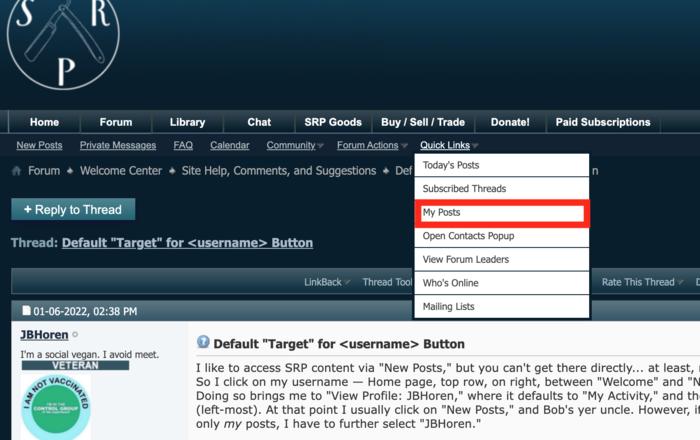
So, I thought may be the best place to put that link was in the 'quick links' menu of the forum subnavigation - the third item from the top.
I'd forgotten a lot about the innards of the software so I had to do some refresh and then I had to do a coupe of tries to guess the name of a variable since it was much faster than 'RTFM'.
A-a-a-nd, here it is, I present to the one person who cares most, and everyone else, the latest addition to our maze of navigation options, the 'My Posts' link. It works OK for me, so may be it'll do the same for Jonathan and will save him a click or two

... And sorry about the somewhat geeky post
-
02-01-2022, 02:39 AM #16I'm a social vegan. I avoid meet.


- Join Date
- Nov 2006
- Location
- Greenacres, FL
- Posts
- 3,366
Thanked: 603
I think you've missed the (my) original point. My goal was to get to "New Posts" -- that's my preferred entry-point to SRP content. Sure, I could go via "Forums" and then drill-down -- which is OK, if I want a deep look into one major forum; but for me, "New Posts" is the best starting point.
So, what's first? The basic entry-point for SRP is the Home page, which is where https://www.sharprazorpalace.com/ drops us. Fine, but there's no menu-bar link for "New Posts". OK, what's the quickest way to get there? I could...
- Click on "Forum"... but that's all the way over on the left (and I'm right-handed); or
- Click on "JBHoren" (my username)... which is conveniently located on the right-hand side.
And THAT is where the whole "clicking on username defaults to the "My Activity:All" view, rather than "My Activity:username". It was a "foolish [missing] consistency" which became a "hobgoblin" to my mind.
The "Quick Links:My Posts" fix is nice, but awkward... and still doesn't change not having a "New Posts" link on the Home page menu-bar. If such a link existed, I'd never have cared (or, at least not written) about "username:My Activity:blah-blah-blah".
That's all. For now, I just STFD, STFU, click on "username", then "New Posts"... and Bob's yer uncle. Why chase the world, when you can simply let it pass you by?
-
02-01-2022, 03:48 AM #17Senior Member


- Join Date
- Oct 2010
- Posts
- 26,211
Thanked: 8626
I feel fortunate we can still see what we want to here by going there.
Always something to do to get there. Yet it pops up!
Could be worse?
-
02-01-2022, 07:24 PM #18

I guess I did miss it.
Under the hood the site's main/home page and the forums are two separate pieces of software. Originally Vbulletin was just that - a bulletin board/forum software, like most of its competitors, but as the market developed there was increased demand/pressure for a more complex 'home page'. Eventually vbulletin seem to have purchased one of the projects that attempted to create that - a content management system for webpages that aren't threaded conversations (i.e. the organization of the forum) and which many consider more suitable for a website's 'home page'.
These two pieces of software are integrated together to a degree at the surface, but fundamentally they remain different and the deeper one goes into it the more apparent the differences are.
With that preface, the home page of the site, i.e. what shows up at the naked domain URL is that other content management system with mostly 'articles' and 'links', and one block that shows sort of a 'window' into the forum part (the 'recent forum posts').
That's why the navigation there isn't in the context of the Forum, but in the context of the 'Articles' - because we are in the other content management system, not the forum. Only once you get into the Form side the navigation becomes forum-centric and you have links to posts, threads, etc.
You may remember that at one point we had also Blogs and Groups as additional components but since they weren't used we removed them. So, currently the four main components of the site are the 'articles', the forum, the library, and the chat (virtually unused anymore so it's probably time to get rid of it as well). I know we have few more links at the top navigation - one to the online store with SRP branded items, which we probably should get rid of, one to the marketplace/classifieds which ended up back as a forum section (however fundamentally it seems like a logically separate section), and two more links, one for donations (used once every two years), and one for the paid services (it's there mostly for the higher visibility).
All this is to say that our structure is what it is for pragmatic and a little bit for legacy reasons, which is perfectly fine for me as the purpose is to serve the community needs. There are some limitations but to me it seems that 'New Posts' link to the top navigation may add confusion.
My browser offers autocompletion and the top choice is usually the most visited page, so when I start typing the forum address it autocompletes to the forum section, not the naked domain, so I'd have 'new posts' on the first page I visit. But since you want to go to the articles side and not the forum side, you are in the article context where there isn't 'New Posts'.
To my mind the logical place for a 'New Posts' link would be in that 'window into the forum' block, so I'll take a look if it's relatively easy to add such a link, but I can't promise anything, as like I mentioned the deeper you go under the hood the more divergent the two parts become.
-
02-02-2022, 12:32 AM #19I'm a social vegan. I avoid meet.


- Join Date
- Nov 2006
- Location
- Greenacres, FL
- Posts
- 3,366
Thanked: 603
Excellent explanation! TYVM.
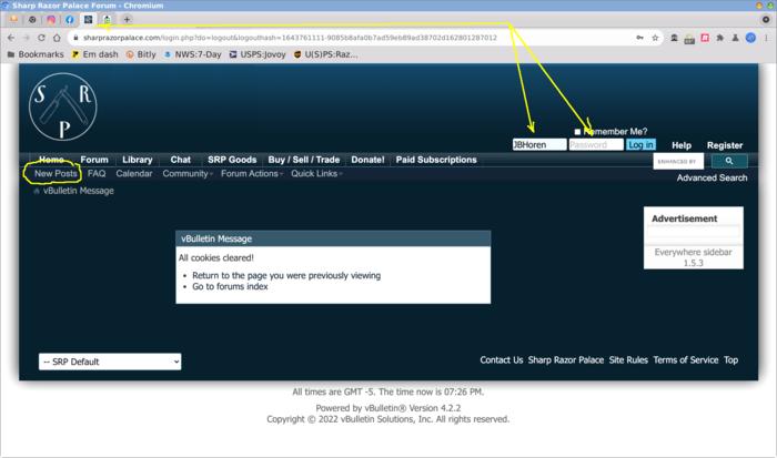
What I've done for SRP (other sites, as well) is to "pin" the tabs in my browser, so they're always available (and if the browser gets closed/restarted, it reopens to those previous locations). Then, when I log out of SRP, it "parks" me on the "logout" page which, as you've so elegantly described, is "inside" -- and, most important, the login "credentialing" dialog (username and password) are already there, ready to be used; thus, the "New Posts" link is present whenever I log in, and I can go on my merry way.
 Why chase the world, when you can simply let it pass you by?
-
02-02-2022, 02:02 AM #20

What the hell did he says?
 It's just Sharpening, right?
Jerry...


 29Likes
 LinkBack URL
 About LinkBacks


 Reply With Quote
