Results 41 to 50 of 63
 29Likes
Thread: Site changes in the near future
 LinkBack URL
 About LinkBacks
-
07-19-2011, 12:32 AM #41Hones & Honing


- Join Date
- May 2005
- Location
- Saint Paul, Minnesota, United States
- Posts
- 8,023
- Blog Entries
- 1
Thanked: 2209
I am really showing my age here.......
In 6 years I have never noticed that I could click on the SRP logo to get to the home page.
Also, thanks for pointing out that the symbol that looks like a TT is supposed to be a house(home) and is a link to the home page. This is the first time I have noticed that the symbol even existed. Literally, for YEARS!, I have wondered how to easily get to the home page. As a consequence, I have rarely went to the home page.
Please note that I am not complaining. Just stating facts. Do with them what you will.
I to have heard from new guys that there is an over abundance of info and they get confused. That is a nice problem to have compared to the past but your efforts to address this is much appreciated.Last edited by randydance062449; 07-19-2011 at 12:48 AM.
Randolph Tuttle, a SRP Mentor for residents of Minnesota & western Wisconsin
-
07-19-2011, 12:42 AM #42Senior Member


- Join Date
- Feb 2008
- Posts
- 32,564
Thanked: 11044
Thanks to HNSB, one of the coolest things I learned recently is ..... when you're looking at the threads menu there is a little blue dot to the left of the title. Click on that and it will take you to the most recent post that you haven't yet seen within the thread. Best thing since sliced bread.
 Be careful how you treat people on your way up, you may meet them again on your way back down.
-
The Following User Says Thank You to JimmyHAD For This Useful Post:
chay2K (07-19-2011)
-
07-19-2011, 01:23 AM #43The only straight man in Thailand

- Join Date
- Jan 2009
- Location
- Bangkok, Thailand
- Posts
- 1,659
Thanked: 235
Oh wow. Thanks for pointing this out. I only just figured it out myself. I always just deleted the extra bit from the URL. Originally Posted by randydance062449

-
07-19-2011, 02:24 AM #44
Randy, you're not that old. All these things are only since March 27 when I upgraded the software. Eric (HNSB) put a lot of work to make the new site match closely the old one, so it may seem the change wasn't that drastic. Here's a picture I made shortly after the transition that shows how the different links on the old page map to the links on the new one:
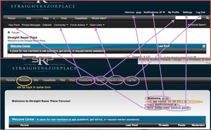
We did try to keep everything that was important more or less to the same spots but some things like UserCP got more intuitive names like Settings and others moved to second level navigation. The search became a direct form instead a link to one and the link to the various search options is now 'Advanced Search'.
We could've made it look exactly like the old site but it was a good opportunity to make few small improvements. We got some complaints but I think that once people passed the 2 week refamiliarization period it was all good.
How about another trick - when you double click on the 'reply' button to a thread it opens the full featured editor instead of the light version of it that a single click does
-
07-19-2011, 02:42 AM #45Mr. Baby Face

- Join Date
- Mar 2009
- Location
- Chicago, IL
- Posts
- 494
Thanked: 66
What about adding a link or picture on the main page with big, bold letters stating, "New to straight razors? Click HERE for the essential basics!" Then link them to either a locked thread outlining the basics of wet shaving, or a mentor's blog specifically meant for beginners. That would keep any newbs from drowning themselves in opinion-based fact. Just an idea.
ScottGoodman likes this.
-
07-19-2011, 02:53 AM #46Little Bear

- Join Date
- Jan 2009
- Location
- Shreveport, LA
- Posts
- 1,741
Thanked: 760
Thanks, guys. I'm a fan of these changes, and I applaud the direction that the leadership is taking the board.
-
07-19-2011, 02:57 AM #47This is not my actual head.


- Join Date
- Nov 2009
- Location
- Middle of nowhere, Minnesota
- Posts
- 4,624
- Blog Entries
- 2
Thanked: 1371
Check out the menu on the left hand side of the home page. ;-) Originally Posted by DerekC
It should be one of the first things people look at if they browse in a typical F or E pattern.
Strange women lying in ponds distributing swords is no basis for a system of government.
-
07-19-2011, 02:09 PM #48Some kind of Zombie


- Join Date
- Feb 2011
- Location
- Le Mars Iowa
- Posts
- 1,019
Thanked: 166
I completely understand the reasons for that...but I'm also in the party with the guys who are going "You can do what?" I accidently discovered that the SRP logo could take me to the home page. I almost NEVER view the home page. I found SRP through a google search and entered via that thread. I never knew the house logo would take me to the home page. When I peruse SRP I usually just click on the forum's link...and nowadays I usually enter SRP via a thread reply e-mail. Originally Posted by gugi
I am grieving the loss of the sig lines for what they told you about the character/personality of the poster. They generally added something to the sense of community.
BUT, I do like the clean threads, and am in favor of removing mundane administrative tasks that are not directly related to the objectives of ANY organization.
I think a HOME button would have been more useful to me when I first started...I don't know how long I went before I discovered that there even was a HOME page. I think the word HOME as opposed to a logo/breadcrumb communicates more clearly to the wide array of people we have accessing SRP.
Didn't even realize that existed...for the aforementioned reasons. Perhaps a HOME button would help others to find that menu more readily. Originally Posted by HNSB
All of that said, I know Eric and all the other developers put in a lot of work to make SRP great and they do a great job. So: THANK YOU! I appreciate the service SRP provides to me as a new straight shaver, and I appreciate the opportunity to interact with some of the vendors in the market in a way that fosters postive growth of the hobby and the industry. I wish the car parts market were more like this! Thanks again!
Peace,
Jim
P.S.>>>While a giant flashing neon sign MIGHT lead newcomers to an introductory thread, I think a large, visually loud link along those lines would be a major detractor from the atmosphere of this site...and I guarantee there would still be people who overlook/ignore it. FWIW!
-
07-19-2011, 03:41 PM #49Curmudgeon in Training

- Join Date
- Jun 2011
- Location
- Boerne, TX USA
- Posts
- 20
Thanked: 3
Maybe it would be worth posting a reminder somewhere about this. Something like, "New? Confused as to which is the wheat and which the chaff? Then pay special attention to posters with Originally Posted by gugi
 below their name."
This sounds like a good compromise and one that will use very little real estate. Great idea! Originally Posted by hoglahoo
-
07-19-2011, 07:04 PM #50
15000+ posts, and you didn't know? Originally Posted by JimmyHAD
You're not the only one though. I recently had a PM from a member requesting that feature.Til shade is gone, til water is gone, Into the shadow with teeth bared, screaming defiance with the last breath.
To spit in Sightblinders eye on the Last Day


 Reply With Quote