
Results 8,731 to 8,740 of 20573
 91474Likes
Thread: What are you working on?
 LinkBack URL
 About LinkBacks
-
04-05-2017, 03:59 PM #8731Razor Vulture


- Join Date
- Oct 2010
- Location
- Lone Star State
- Posts
- 26,121
Thanked: 8612
As I understand, bone and ivory 'move' with changes in humidity and temperature.
With that in mind, sealing one side with CA or the like may not be the best thing?
I suppose if one was to do it, sealing the whole things may be best?MisterClean likes this.
-
The Following User Says Thank You to sharptonn For This Useful Post:
MisterClean (04-05-2017)
-
04-05-2017, 05:30 PM #8732Senior Member

- Join Date
- Apr 2012
- Location
- Diamond Bar, CA
- Posts
- 6,553
Thanked: 3215
Always seal both sides, or it will cup on you.
-
The Following User Says Thank You to Euclid440 For This Useful Post:
MisterClean (04-05-2017)
-
04-05-2017, 09:20 PM #8733Skeptical Member


- Join Date
- Nov 2016
- Location
- Colorado Springs
- Posts
- 10,545
Thanked: 2194
@Outback I ordered the Howards restore a shine to add to my collection of stuff. I'll give it a go on the scales when it gets here. Hoping to bring up the polish/shine on these last scales I made.
Lots of nice work going on here guys. Fine work and great jobs as always.It's just Sharpening, right?
Jerry...
-
04-05-2017, 09:55 PM #8734Senior Member

- Join Date
- Feb 2013
- Location
- Haida Gwaii, British Columbia, Canada
- Posts
- 14,443
Thanked: 4828
When I used the ca I did both sides to avoid that happening. It did make for a nicer finish and I broke the scales pinning them so I have no idea about the long term.
It's not what you know, it's who you take fishing!
-
04-06-2017, 02:02 AM #8735Str8Faced Gent.


- Join Date
- Aug 2013
- Location
- Orangeville, Ontario
- Posts
- 8,456
- Blog Entries
- 1
Thanked: 4207
Working on the font for the Otto etch and I tell ya men, block script that's worn or deformed is impossible to clean up in paint programs no matter the zoom level you work at.
Case in point;
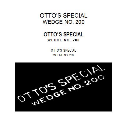
The three upper sets are actual new typed characters in a variety of TTF's, and the white on black is the original image off the actual scales, cleaned up as best I could.
Realizing the total image on the scale will be quite small maybe the sins in the original will not look as bad as I fear, and I am going to run all of them onto actual stock and then let the project manager decide,
They used unique spacing on the rows in the original that also were not easy to match up. For example, the upper row @ a font size of 16- normal character spacing and a lower row of say font size 6 would have the lower row too close to each other compared to the upper so I had to finesse row height as well as character spacing to get them as close as I have.
Anyway, that's what's goin on up here tonight.
 "Depression is just anger,, without the enthusiasm."
Steven Wright
https://mobro.co/michaelbolton65?mc=5
-
-
04-06-2017, 02:07 AM #8736Historically Inquisitive

- Join Date
- Aug 2011
- Location
- Upstate New York
- Posts
- 5,782
- Blog Entries
- 1
Thanked: 4249
High grit hones doesn't always equal a smooth sharp edge, that we all chase.Perhaps it's the hand behind the stone, don't ask how I know... Originally Posted by Gasman

Last edited by Martin103; 04-06-2017 at 02:11 AM.
-
The Following User Says Thank You to Martin103 For This Useful Post:
sharptonn (04-06-2017)
-
04-06-2017, 02:13 AM #8737Razor Vulture
- Join Date
- Oct 2010
- Location
- Lone Star State
- Posts
- 26,121
Thanked: 8612
Really! I spend lots of time toning down edges. Never have seen the need for a 20k? Originally Posted by Martin103
It must be a 6-stroke hone!
-
04-06-2017, 02:15 AM #8738Historically Inquisitive
- Join Date
- Aug 2011
- Location
- Upstate New York
- Posts
- 5,782
- Blog Entries
- 1
Thanked: 4249
Same here Tom, tone down from 16 k shapton to natural usually gain smoothness.
-
04-06-2017, 02:17 AM #8739Razor Vulture
- Join Date
- Oct 2010
- Location
- Lone Star State
- Posts
- 26,121
Thanked: 8612
I think it looks awesome, Mike! Originally Posted by MikeB52
Let's keep in mind that the originals were hot-stamped!
Mostly less than perfect.
Less than perfect is authentic!
So hurry-up and do those so I can persuade Tuzi to make me a set of green ones for my Green Lizard so I can send it to you so you can do the lizard thing on them!
That!
-
04-06-2017, 02:25 AM #8740Senior Member

- Join Date
- Mar 2015
- Location
- Akron, Ohio
- Posts
- 12,070
Thanked: 4312
[emoji38] [emoji38] [emoji38] [emoji38] [emoji38] [emoji38]
Mike
-
The Following User Says Thank You to outback For This Useful Post:
sharptonn (04-06-2017)


 Reply With Quote