
Results 8,751 to 8,760 of 20573
 91473Likes
Thread: What are you working on?
 LinkBack URL
 About LinkBacks
-
04-06-2017, 03:23 AM #8751Razor Vulture


- Join Date
- Oct 2010
- Location
- Lone Star State
- Posts
- 26,152
Thanked: 8616
Sorry, Rez!


-
04-06-2017, 03:55 AM #8752Str8Faced Gent.


- Join Date
- Aug 2013
- Location
- Orangeville, Ontario
- Posts
- 8,456
- Blog Entries
- 1
Thanked: 4207
In the "on deck" circle for the burl blast blanks is green actually as a heads up.
A green swirled with the the right burls might look pretty cool I'm thinking so it's on the to cast list..
Just in case folks are interested..similar to the blue and red it shall be I expect..."Depression is just anger,, without the enthusiasm."
Steven Wright
https://mobro.co/michaelbolton65?mc=5
-
The Following User Says Thank You to MikeB52 For This Useful Post:
sharptonn (04-07-2017)
-
04-06-2017, 11:36 AM #8753Senior Member

- Join Date
- Jun 2016
- Location
- NH
- Posts
- 1,924
Thanked: 1363
This is looking AWESOME, Mike! It's true, on the original scales the letters were not perfect so I'm thinking perfect looking letters would look less than authentic? Whatever you come up with will be fantastic I'm sure, and very much appreciated. The work and careful consideration you are giving this project is amazing and I want to say another big THANK YOU! It feels pretty cool to have something of mine in your workshop/laboratory. Originally Posted by MikeB52


In the meantime, I'm going to repaint the lettering on the blade to try to get a brighter red. I'll follow (outback) Mike's suggestion and put a coat of white in the tang stamp first then follow up with red."Go easy"
-
-
04-06-2017, 12:09 PM #8754Senior Member


- Join Date
- Mar 2015
- Location
- Akron, Ohio
- Posts
- 12,107
Thanked: 4313
Make sure the white is good and dry before the red....unless you want pink. Originally Posted by xiaotuzi
 Mike
Mike
-
The Following User Says Thank You to outback For This Useful Post:
sharptonn (04-06-2017)
-
04-06-2017, 02:27 PM #8755Razor Vulture
- Join Date
- Oct 2010
- Location
- Lone Star State
- Posts
- 26,152
Thanked: 8616
GAWD, Mike, those things are like neon! Where on EARTH did you............ Originally Posted by outback
Nevermind!
-
The Following User Says Thank You to sharptonn For This Useful Post:
outback (04-06-2017)
-
04-06-2017, 03:42 PM #8756Senior Member

- Join Date
- Aug 2014
- Location
- East Central Illinois
- Posts
- 782
Thanked: 101
I hear you! Some razors do not like my 16K Shapton Glass hone. I have found doing 4 to 8 very light , no pressure laps on my Coti. make it shave much better & smother after the 16K hone. Originally Posted by Martin103
Slawman
-
The Following User Says Thank You to Slawman For This Useful Post:
Martin103 (04-06-2017)
-
04-06-2017, 04:29 PM #8757Senior Member
- Join Date
- Jun 2016
- Location
- NH
- Posts
- 1,924
Thanked: 1363
A coticule is usually the last stone my blade touches as well. My face, especially my neck, is subject to irritation if the edge is too crisp from a high number synthetic. A handful of passes on the coti after my highest synthetic puts it right in the sweet spot for me.
"Go easy"
-
The Following User Says Thank You to xiaotuzi For This Useful Post:
Martin103 (04-06-2017)
-
04-07-2017, 02:54 AM #8758Str8Faced Gent.
- Join Date
- Aug 2013
- Location
- Orangeville, Ontario
- Posts
- 8,456
- Blog Entries
- 1
Thanked: 4207
Nearly ready to drop the hammer.
Went with the original scan as per consensus and have scaled the dimensions to those recorded off the originals.
Trialed it out on a scrap of corian as it gives a cleaner edge than wood and filled it for effect.
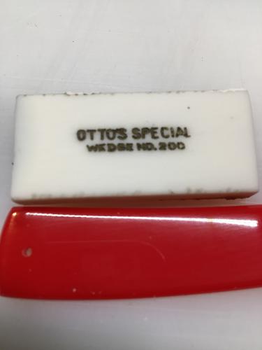
And Tuzi, appreciate the fine compliments, and your patience on the job. I'm thorough, not fast, hehehe
 "Depression is just anger,, without the enthusiasm."
Steven Wright
https://mobro.co/michaelbolton65?mc=5
-
-
04-07-2017, 02:56 AM #8759Historically Inquisitive

- Join Date
- Aug 2011
- Location
- Upstate New York
- Posts
- 5,782
- Blog Entries
- 1
Thanked: 4249
Looks very cool Mike, looks aged, like it's been around for years.
-
-
04-07-2017, 02:58 AM #8760Razor Vulture
- Join Date
- Oct 2010
- Location
- Lone Star State
- Posts
- 26,152
Thanked: 8616
Perfect, Bruv!
-
The Following User Says Thank You to sharptonn For This Useful Post:
MikeB52 (04-07-2017)


 Reply With Quote
